The biggest takeaway I want you to get from this article is to keep your paid search landing pages simple. I notice a lot of paid search landing pages chuck full of so much information that it becomes overwhelming to read let alone take away anything from it. When I land on pages like these, it brings to me the same feelings of when I have so much to do that I don’t know where to start. This is not what you want your visitors to feel.
We live in a world of people with short attention spans and an internet full of information and offerings. If a visitor doesn’t quickly find what they are looking for, they will bounce and move on to the next offering because it is easy. In the paid search world you usually only get one shot to capture the attention of your visitor and convert them. Today, we are going to talk about keeping your paid landing page simple and the essential components you should include on your paid landing page for better conversion rates.
I will refer to visitors of a landing page as prospects. I like this terminology better because it puts me in the mindset that my visitors are not just there to visit and leave, but prospects are opportunities for conversion. We will primarily focus on lead generation paid landing pages, although a lot of these principles can also apply to e-commerce paid landing pages.
Prospects should be able to understand the purpose of your landing page and the value you bring to them within seconds of landing on the page. Keep your landing page design, content, and flow simple enough for the prospect to easily find what they are looking for but rich enough for them to want to fulfill your CTA. The prospect will usually fulfill your CTA if they are looking to learn more. Prospects don’t need to know every detail of your product or offering, but just enough to peak their interest to want to learn more and fulfill your CTA. Give them a taste of what you have to offer and drive their hunger for more.
If you want to know if your page is easy to read, is understandable, and flows well, then run a speed test. Give someone five seconds to look over your landing page. Hide the page and ask them what they believe the page is about and what action was to be completed. If they can’t tell you these simple answers, then your page isn’t ready. Find individuals that know nothing about your industry or product. Design your page so that they can even understand the basics of your offering and the purpose of the page. Think simple in your copy, flow, and layout. A great tool to help you test the design and layout of your paid landing page is UsabilityHub.com.
We know that to keep a prospect interested and on our paid landing page, we need to design them so that they are simple, understandable, and flow well. But, what are the absolute essential components of a paid search landing page to help it convert without becoming overwhelming?
Here are the five essential components I believe each paid search landing page should have to generate the best possible conversion rates.
As I walk through and describe each of these essential components I will highlight a poorly performing landing page that we redesigned that resulted in an immediate jump in conversion rate.

We will first start with the header of the page. The page header should include a title and short description. It should be clearly stated and match the subsequent page copy. You will want to create a header that allows the prospect to quickly know and understand the purpose of the page. The header should be one of the first things the user should see and it should match the keyword query and ad.
Within the header, you will want to include a positioning play. A positioning play will articulate a unique value your product, service, or company brings. The positioning play stakes a claim and occupies a location. Think about what sets you or your offering apart from your competitors. Claim it and own it.
Title – Short, clear, and can easily sum-up the content and purpose of the page. It confirms that the proceeding content matches your keyword query and ad.
Description – Here you will insert your positioning play. The description should define your product or offering, but also stake a claim. Don’t get carried away here. Keep it short, sweet and powerful. I try to keep my description less than three lines and readable within the five second speed test. 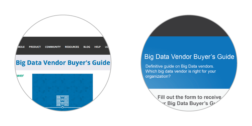
Notice that in the first landing page it is easy to see that the page is about a Buyer’s Guide but it isn’t easy to understand the purpose of the page or that there is an offering with value to the prospect. Similarly, in the redesigned landing page we see that the page is about a Buyer’s Guide, but we also see a short description explaining what it is using a positioning play along with a question that connects the prospect to the guide. The positioning play on the new page is a, “Definitive guide on Big Data vendors”.
Within your paid landing page, you should have content that explains the value of your offering to your prospect. I call these value points benefits. Every business can come up with a mile-long list of benefits their offering can bring. Generally, this is where we will see people get carried away in their landing pages.
When I think of benefits to include on my paid landing page, I will focus on the main pain points of the prospect. I will come up with a list of pain points and rate them from greatest to least pain it causes my prospects. I will usually pick the top three pain points, no more than four and create benefits that address and solve them.
Each benefit should offer a desirable and compelling solution to each pain point. Benefits should be short, clear, and concise. The prospect should know exactly what they are getting. Remove any fluff and unnecessary wording. The prospect should also be able to segment and evaluate these benefits with minimal effort. Remember the five second test.
When I create my benefits I usually create a short headline and a short description. The headlines are easy to read and scroll through, yet there is more information in the description if they desire to learn more. Our world is full of people who skim content instead of taking the time to read it. Make it easy for them to skim your content and dive into what they desire.
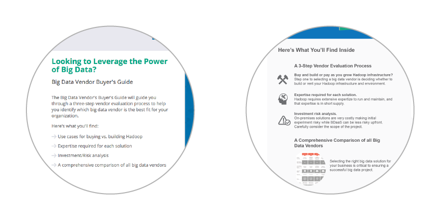
Here we worked on segmenting out our benefits and made it easier for the prospect to read and understand what they were getting within the guide. We created a title that was very easy to understand and that would best explain what proceeded. To best represent the offering, we highlighted two main benefits from the guide and three sub points (benefits) of one of the main benefits.
Not all paid landing pages need to have a form on the page. Some landing pages will have a CTA that clicks through to an application or form on another page. If you are an e-commerce site, you most likely have a Buy Now button that sends your prospects to a purchase order page. For those looking to acquire information from your prospects, I recommend placing the form on your paid landing page instead of directing them to another page. The less barriers to conversion, the better chances you have of converting your prospects. Obviously. Directing your prospects to more pages than what is necessary just gives them more chances to leave. Every industry is different so test, test, test and find out what works best for you.
If you do have a form on your landing page here are some general guidelines.
The form should be simple and clear, yet it needs to stand out. It fulfills the main purpose of the page. Prospects shouldn’t make any guesses or assumptions to the purpose of the form. The form should be clean and should draw the attention of the prospect after they read the page header. Please pay attention to the design of your form, especially spacing between the title, form fields, CTA, and outer border. I have seen a lot of bad form designs, mostly from easy plug-in tools. The CTA button, color, size, placement, and text should stand out and quickly capture the prospect’s attention.
There are three essential parts of a form: the title, form fields, and CTA button.
Form Title – Make it simple. It should be different from your page header but should be an extension of the header to drive the prospect to action.
Form Fields – Keep your form fields to a minimum. Generally, there is a correlation between fewer form fills and higher conversion rates. A/B test and learn the optimal number of fields for your forms.
CTA – Make it stand out and catch the prospect’s eye. Try to evoke ownership or emotion into your CTA and test it to see if it converts well.
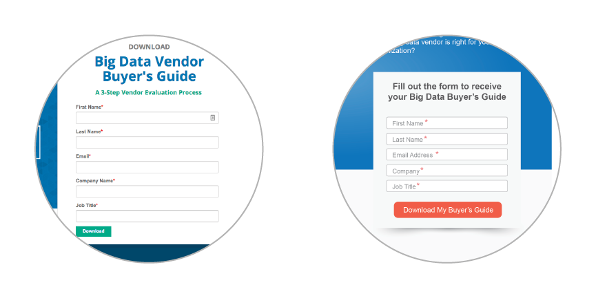 The new form stands out visually on the landing page. The old form competed with the other content on the page which was split into three distinct sections. The new form clearly states what its purpose is. The CTA buttons are vastly different. We made the new CTA stand out by using a red color that still matches the theme of the page but allows the CTA to pop out to the prospect. We also played with different CTA text and initially started with one that evoked emotion and ownership to the prospect. I recommend testing multiple CTAs for your forms.
Most prospects will have never heard of your brand. The best way to instill trust from a landing page is to include proof. Prospects are more likely to give up information or buy from companies that they can trust. This is especially important in our day in age with so much online fraud. Proof can be manifested on your paid landing page by showing companies or brands that use your product or service, testimonials, or third party affiliations like awards received.
Companies/Brands – Listed well-known companies or brands that use your product or service can be of huge influence to a prospect selecting your brand over a competitor.
Testimonials – Short, reputable, and powerful testimonials are great because they don’t take up a lot of space, are easy to read, and can leave the prospect feeling good about your product or service.
Third Party – Includes seals, certificates, partners, or awards you have received or are affiliated with.
Generally, I show proof through a list of companies or third party logos, or I create a small testimonial section. Don’t get too carried away with listing these on your landing page. You don’t want to take away from the benefits of your page. Your main selling points will be within your benefits, but occasionally it will be within the proof. Proof is important, but make it a secondary focus to your benefits and form.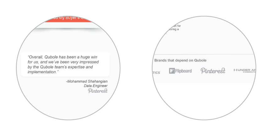
Here are ways we showed proof on the new landing page. There was no proof on the old one. We used reputable brands that used our services and a short but powerful testimonial from a very reputable source.
Remove link leaks on your paid search landing page. We call any link that takes a prospect away from the page that is not associated with the CTA a link leak. Most paid search landing pages won’t have any way to re-access the page once the visitor has clicked away onto your site or another. Keep prospects on your landing page and control the environment they are in by removing any link leaks from the page
Keeping your landing pages simple is vital to your success and should be one of your main priorities. Design and layout your paid search landing pages so that they are easy to read, understandable, and flow well for your prospects. The five second test is a great way to understand and fine-tune your design and messaging. Keep your landing pages simple by including these five essential components of a paid search landing page: the header, benefits, form, positioning, and proof. Focus on optimizing and testing these essentials and you will have a greater chance of maximizing your conversion rates.


