With shrinking attention spans and endless digital content in 2025, it’s harder than ever to stand out. Enter the infographic! A well-structured infographic turns complicated or “boring” information into something clear, engaging, and easy to digest in seconds. If you’ve ever wondered what makes a good infographic, you’ve come to the right place. In this article, we’ll go over 7 tips for making your infographics picture-perfect. Done right, an infographic can make your content unforgettable.
In 2025, people want answers fast. Long reports and walls of text often go unread, but visuals cut through the noise. Infographics present data and insights in a format that’s quick to scan, easy to share, and simple to remember. Infographics double as pretty visuals and communication tools that help your audience grasp complex information at a glance. From social media to sales decks, a strong infographic can extend the reach and impact of your message.
An infographic distills complex data into a structured visual format that the brain can process faster than text alone. Studies in cognitive psychology confirm that people retain information more effectively when it is paired with visuals, because the human brain processes images up to 60,000 times faster than text. That means your audience can understand trends, relationships, and comparisons at a glance rather than working through pages of copy.
From a marketing perspective, infographics are also highly versatile. They can improve on-page engagement by breaking up content, drive backlinks as shareable assets, and perform well across platforms, from LinkedIn posts to conference presentations. When designed with accessibility and mobile in mind, they increase reach even further by ensuring clarity across devices.
So, what makes a good infographic stand out from the rest? The best designs share a few common elements: credible data, clarity, storytelling, smart visuals, simplicity, breathing room, and adherence to design standards. Together, these elements form the foundation of an infographic that catches readers’ attention. Let’s break down each one.
The key to a good infographic is using relevant, focused, and reliable data. Before you write or design, get to know your audience. Why are they interested in your topic? How much do they already know? Do they have preconceived ideas or opinions about your topic? Answering these questions will help form more relevant data and visuals. An infographic should be a visual presentation of evidence, with purpose and direction, not just an excuse to use pretty pictures. Don’t include facts just to up your word count. Make sure your facts and data support the overall story and have a purpose.
Especially when choosing a controversial topic to be thorough and speak to both sides of the story. Think through the topic’s possible arguments and counterarguments. Use facts, statistics, and authoritative quotes that are unbiased.
Use as little text as possible and let the visuals do the rest of the talking. Present the data in a visually pleasing way, stating hard evidence. Facts, statistics, and quotes from authorities should be used more than lengthy sections of text. Cite your sources. Always give credit where credit is due, and use reputable sources.
Thinking outside the box is great. Just make sure you are still making sense. Don’t use confusing comparisons or complicated visuals. Lead the audience through the infographic using both text and visuals.
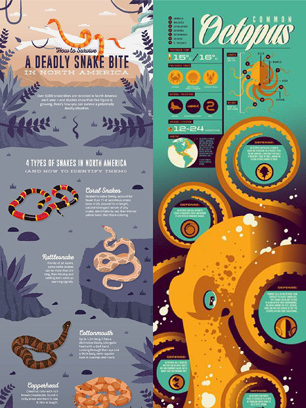
An infographic should not just make data interesting, but help the reader understand it better than text alone. Don’t rely on the reader to do the work. Guide them through the information as clearly and simply as possible. Data visualizations draw attention and give importance to seemingly boring facts. The right visuals can distill a difficult concept or lots of data into an easily digestible image that should only take 5 seconds to understand.
“An infographic is 30 times more likely to be read than a purely textual article.”

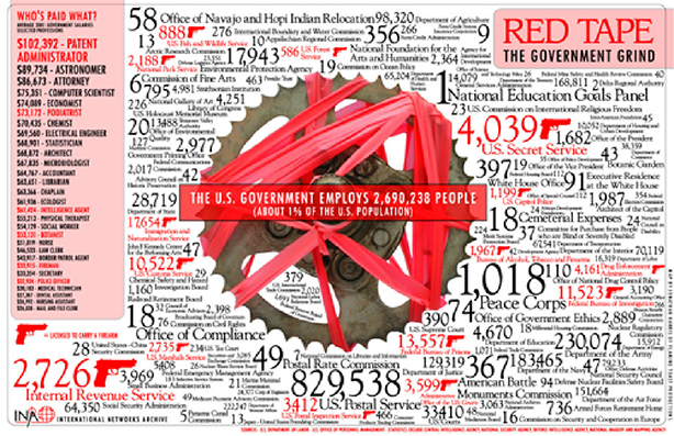
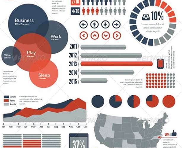
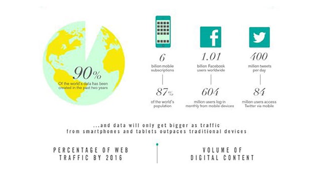
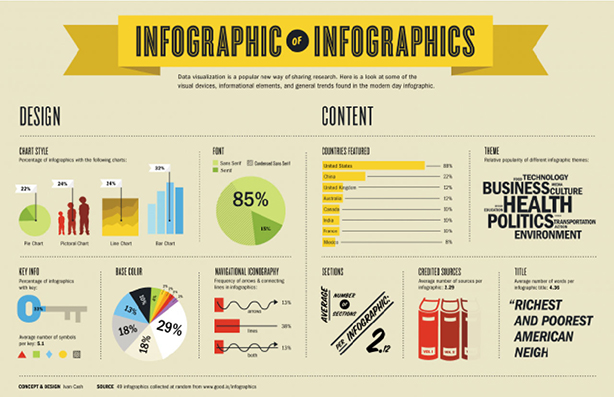
Display the data using a variety of charts and graphs. Make sure to choose the right graph or format for the data you are sharing. Always check that the graph makes sense visually, without the need for extensive knowledge on the subject or heavy reading. Below are a list of a few types of graphs and charts that can be used in creating an infographic.
More doesn’t always mean better. In fact, clutter is the fastest way to lose your audience. A simplified infographic strips away distractions and highlights only the essentials. Stick to one main point per section. Use a limited color palette. Don’t let decorative elements compete with your data. Remember, an infographic is meant to clarify, not complicate. Consider color theory. Do the colors help tell the story? Why?

White space isn’t wasted space; it’s breathing room. It separates ideas, guides the eye, and makes complex information feel approachable. Imagine walking into a crowded room vs. one with open pathways; which feels easier to navigate? The same principle applies here. Use white space to group related visuals, emphasize hierarchy, and keep the design from overwhelming readers.
The typical infographic should be no more than 5000 pixels tall. This size allows for easy reading and sharing; anything longer will likely lose the audience's attention. Make sure the font is a healthy size and easy to read. An infographic is NOT an entire article with icons and images sprinkled in. As one marketer said,
“‘Infographics’ is one efficient way of combining the best of text, images, and design to represent complex data that tells a story that begs to be shared." - Jeff Bullas
Infographics, if created and used correctly, can communicate complex data in a visually pleasing way that can get you more clicks, views, and shares.

A good infographic is clear, focused, and visually engaging. It should tell a story, use reliable data, and be easy to understand in just a few seconds. The best ones are also mobile-friendly, accessible, and shareable across multiple channels.
What makes a good infographic is partly its length. Most perform best under 5,000 pixels tall, which allows readers to scroll easily without losing interest. Keeping it concise ensures your audience stays focused on the main takeaway.
When people ask what makes a good infographic, the answer often starts with what not to do. Overloading with text, using confusing visuals, or skipping source citations can all weaken the message. A strong infographic avoids clutter and keeps the design focused on clarity.
Simple charts like bar graphs, line charts, and pie charts are usually most effective. Save more complex visuals — like scatter plots or bubble charts — for when they genuinely add clarity. Always match the chart to the type of data you’re showing.
Yes. Always cite your sources. Credible, transparent sourcing builds trust and authority. Place citations at the bottom of the infographic or include them in the caption on your site.
Distribution plays a big role in what makes a good infographic successful. Keep the design clean, the story sharp, and then repurpose it into social media snippets, carousels, or short videos. The more channels you use, the more visibility your infographic gains.


