Meta ads win or lose on creative. Your targeting and budget can be flawless, but if the creative falls flat, the campaign fails. Sharpening your ad creative is one of the highest-return moves you can make on Meta. Strong creative catches attention in a crowded feed, tells a story quickly, and drives action. Any brand can apply these practices to improve performance.
At 97th Floor, we build and test Meta ad campaigns that deliver measurable ROI. These are the Meta creative best practices we see work time and again, backed by real examples you can learn from.
Let’s get into it.
Because they compete on design and emotion, luxury brand ads are great examples for creative execution. As a matter of fact, Meta is basically the only place many luxury brands are putting their paid media dollars. A smattering of ad budget goes to display ads or YouTube, but well over 75% of luxury brands' advertising efforts happen on Facebook and Instagram.
We’ve pulled Meta ads from ten luxury home brands to see how they’re pairing copy and imagery to entice their buyers.
Use these ads and our analysis as inspiration for your own Meta ads; there’s lots to think about here.
You’ve got a second—maybe less. That’s how long your ad has to earn a pause in Meta’s feed. One way to stand out is to create depth in your visuals. It makes static imagery feel more alive and immersive, pulling the viewer in instead of letting them breeze past.
Nearly all of Arhaus’ product photography, including the images in these ads, uses light and shadow to create dimension. The effect is that we can’t help but imagine what the rest of the room must look like – what must be causing those shadows – and it’s breathtaking.
The ad copy further transports us; it’s hard not to feel a warm breeze and hear the chatter of friends and neighbors.
With both imagery and copy, Arhaus’ Meta ads have us daydreaming about the possibilities a new outdoor set can introduce.


Busy feeds are packed with loud colors and visual overload. Sometimes, the most effective creative is the quietest. Giving your product room to breathe with negative space draws the eye and signals confidence. It says, “This is the whole story, and it’s worth a look!”
Instead of staging the pieces as in a home, Maiden Home’s elegance and beauty is presented uncluttered and unadorned, inviting audiences to carefully inspect the shapes and colors at play.
In these examples, the chairs are intriguing enough that standing alone is the only way to do them justice. The pieces make us curious, and the simplicity of the ad compels a click.


Authenticity wins attention on Meta, and nothing says real like content from actual customers. Showcasing your product in real homes or hands builds credibility and sparks ideas for viewers imagining the product in their own lives.
Castlery proves their products’ versatility by featuring the homes of real buyers in their ads. By showing actual living rooms of delighted Castlery shoppers, the ads supply both social proof and styling inspiration for a wide range of homeowners and decorators.


Flat visuals blend in and get forgotten. Using layered colors, tactile textures, and bold materials makes your ad feel more dimensional, more physical, and more emotional. In a fast-scroll environment, that emotional hook matters more than polish.
Giorgetti’s ads feature rich colors and a mix of interesting materials. The spaces feel out of a biopic about a brilliant musician or a mysteriously wealthy young person. We’d love to know what the fabric and the walnut talk about; we’d love to pull those pieces right off the screen and into our front room. Girogetti’s photos and copy promise audiences a “unique and personal” experience that immediately feels natural and inviting.


Want instant relevance? Tie your creative to something your audience is already thinking about. Whether it’s a pop culture moment, a viral trend, or an awards show red carpet, aligning your product with the conversation earns quick attention and clicks.
In this Meta ad, Koket highlights the similarities between Lana del Ray’s Met Gala gown and Koket’s side table. The two are remarkably alike! Whether their Met Gala-inspired Meta ad was a stroke of luck or a careful analysis of the evening’s attire, we’ll never know. Is there an audience match here? Do Koket shoppers love Lana? Not so sure. But perhaps Koket’s audience is abuzz about fashion, design, and what the A-listers wear. Not too much of a stretch, is it?

Words shape perception. If your copy says “elegant,” your visuals better deliver on it. Great Meta ads use language that complements the look, feel, and energy of the product being shown, creating a seamless experience between what’s read and what’s seen. The words and images used in Rove Concept’s ads promise what luxury furniture should provide: sophistication – in your home office, on your balcony, and everywhere else.


Product specs are forgettable. Stories stick. When your copy hints at a journey, a person, or a place, your ad becomes more than just a sales pitch. It becomes an invitation into a narrative your audience wants to join, or better yet, buy into.By giving its audience a few examples of what these stories may be and referencing their globally-sourced products, Currey & Company promises eclectic and delightful pieces without all the tariffs and bubble wrapping that accompany a purchase, and without an online cart. The copy here brilliantly matches the unusual pieces shown in the photos, and we imagine most people are interested in a ceramic cow, truly.

Sometimes the best way to sell a product is not to sell it at all, at least not right away. Ads that offer help, tools, or personalized advice can win trust faster than a discount ever could. Especially in cluttered categories, utility becomes a real differentiator.
Lulu and Georgia Meta ads sell furniture by offering free design support. Clever, ehh? Their Meta ads offer custom floor plans and mood boards made by Lulu and Georgia designers, which we’re confident will be full of Lulu and Georgia rugs, end tables, couches, and decorations. The ad copy here could’ve gone a little farther to exaggerate the pain point: trying to curate a beautiful space is a lot of work. Especially if you’re working off of a Pinterest board on which half of the links to that dreamy chandelier or pinstripe curtain set are missing or broken. Lulu and Georgia could ramp up the language around their unique selling point to strengthen these ads, but we applaud the strategy here.
Your audience isn’t just buying a product; they’re solving a personal need. If what you offer can be tailored to fit them perfectly, lead with that. Customization on Meta is an opportunity to show that you really get your customers. Interior Define’s ads invite their audience to take the designer’s seat and build bespoke furniture, choosing from hundreds of materials, features, and finishes. Surprisingly, the ads don’t focus on the boast of owning one-of-a-kind pieces. Instead, their advertisements offer help and a solution for shoppers who feel they’re never satisfied. Interior Define says, “Don’t settle.” Well, except into your custom couch, I suppose.


The right backstory can instantly elevate your product. Whether you’re born from a famous collab, a niche community, or a cultural hotspot, tying your brand to its origin story builds instant trust and makes your product feel more worthwhile.
The Soho Houses are a collection of beautifully designed homes dotted across the globe as safe havens of inspiration for members-only creatives. Soho Home came to life when guests came begging to know where they could purchase the magnificent pieces curated for each unique House.
As a consequence of this opportunistic arrangement, Soho Home pieces seem bespoke and almost necessary for a creative and inspired space. Their pieces are automatically associated with exclusivity, travel, and the arts. We’d mention the Soho Houses in every one of our Meta ads, too.


Meta Creative Testing and Optimization
Creative fatigue means wasted spend. Even the strongest ad will lose its edge if shown too often. Testing your creative isn’t an optional thing; it’s the backbone of sustainable Meta ad performance.
Use A/B testing to compare different visuals, headlines, CTAs, and copy angles. Meta’s built-in tools like Experiments and A/B Tests make it easy to isolate variables and track results. Don’t just test once; keep testing on a rolling basis. The goal is to find what works now, not what worked last quarter.
Tip: Test early and often, but don’t test everything at once. Focus on one change at a time so you know what’s actually making a difference.
No matter how good your strategy is, the wrong creative can tank performance. Here are a few of the most common mistakes we see on Meta:
The simple fix is to think like your audience. Would you stop to read your ad?

Today, 97th Floor reintroduces its brand identity, positioning, and promise to our clients and partners, fully embracing our history while turning to the future of marketing and our place in the industry.
97th Floor began in 2005 when founder Chris Bennett set up shop from his basement. Chris had a clear vision of what 97th Floor could become, an agency serving a growing market—up in the clouds—with the best.
Thus, 97th Floor was born. An ambitious marketing operation whose name set it on a course to become what the best brands in the world are. That ambition has held. It’s evident in the internal innovation and molding of our agency that’s taken place over nearly two decades as employees thrive in a culture that empowers them to do the best work imaginable.
All this innovation and energy buzzes through 97th Floor on a daily basis. In 2022, it was time to make a move and bring our brand forward both visually and in our positioning.
Hours of reading, interviewing, brainstorming, writing and rewriting, to say nothing of the tireless work of our design team, have come to fruition today. With optimism for the future, we set our stakes in the ground as a marketing agency for the ages.
From its beginning, 97th Floor has been committed to elevating people and brands that we believe in. Our marketing has been a means to that end, but that's not all. We take pride in building growth strategies for some of the best brands in the world. We are committed to Great Marketing. These concepts have lived inside us, and now they take the stage as our Three Pillars for Great Marketing.
There are three essential criteria that combine to make Great Marketing:

Empathy: The thorough exploration of who our target personas are beyond their role as potential buyers of our products and services. Marketing that makes a profit at the expense of an audience—without truly caring about them—can make gains in the short term. But today's buyers will hold these profiteers accountable in the long run.
Innovation: The experience to know the best marketing practices, but also the guts to break out of it in just the right ways. In a market where change is so rapid, "safe" marketing will no longer yield predictable wins. Taking (calculated) risk is, in reality, the only way to grow.
Profitability: The discipline to measure and make an honest accounting of every marketing strategy by its ability to drive profitable growth. None of the metrics marketers report on matter if there is no route to long-term profitability. Impressions, clicks, leads, MQLs—without a clearly defined path to revenue—aren't enough to make marketing truly great.
Logo: Our primary logo has not changed through this brand refresh, although you may see it presented differently now and then. Our big, red Nine-Seven is the logo we associate with a never-ending chapter of innovation and exploration—and it’s the logo we’re keeping. We are introducing a secondary logo, however, that adds a little more context when needed.


Colors: 97th Floor’s colors are inspired by the nature of the Utah mountains. Their use allows us to employ our bold 97th Floor red in more tactical and creative ways throughout our brand. And to be honest, they give us a lot more to play with as we tell our story.

Imagery: At 97th Floor, people come first. Our brand reflects that! We’ve created hand-made animated scenes of everyday people in everyday life to convey our attention to, and understanding of empathy for real people—the people our clients need to connect with. Each animated character you see is based on a real human in real life—our employees, our friends, and even our clients.
97th Floor employees each get their own avatar too.


Animation
Hand-designed humans in their scenes are a great start, but we wanted to bring them to life—living their lives. Our first scenes take place in a home, an office, a downtown square, and an airport. (And you can see all of them on our homepage as you refresh the page).

The performance of our website—our ability to help our visitors find the information they're looking for—is the culmination of all our efforts. Every new design, layout, and piece of content you see was scrupulously selected in an attempt to remove friction along our buyer's journey.


We look ahead with excitement to a marketing future that's constantly changing. With a commitment to our clients and the principles we've laid out as Great Marketing, we will continue to create cutting-edge campaigns for those brands ready for sustainable growth. Thank you for coming along for the ride!
Typeface: Manrope for headlines; Cambria for body copy. We want our paragraph text to feel classic and academic, while keeping our titles bold. This mix of serif and sans-serif fonts helps us strike the perfect balance.

Mood boards:
A brand is a feeling. Thus, our brand refresh started on mood boards. Many, many mood boards. What did we want our brand to feel like? What thoughts, ideas, and emotions did we want visitors to feel when interacting with our brand? These mood boards were a playground for design and for many obscure and delightful ideas that ultimately led us to our existing brand design.


Iterations of the brand colors and scenes:
We moved through several iterations of brand design concepts, colors, and schemes. Eventually, we arrived at our current design as a perfect convergence of sophistication, confidence, empathy, and approachability.


Storybrand:
Meanwhile, a more philosophical work was taking place as internal leadership discussed our core beliefs as an agency. Many thought exercises and hours of research debated by impassioned marketers showed us that the heart of 97th Floor is strong and opinionated. One particularly impactful exercise was that of moving our hero—our client—through a hero’s journey as described by AUTHOR in Storybrand BOOK. Many of the notes on this whiteboard are translated into the copy on our website, in our brand assets and writing, and on our social media.
Wireframe to Figma Mockups:
With design ideas and taglines swirling around, it was time to start building a framework for the new website. Each page was first created in Lucidchart, offering design the elements necessary for each page on the website.
Finally, the design team transformed wireframes into a true vision on Figma and our skillful developers brought it to life at 97thFloor.com.


Revolutionary branding can change how customers perceive an entire industry, but few companies are willing to take that step in the dark. Uncharted territory comes with a lack of data and research to back your efforts—it takes guts.
Moz said it best. “Playing it too safe is...a great way to remain somewhere in the middle. Almost everyone likes the middle. Nobody loses their job in the middle. Customers come and go at a steady rate in the middle. Nobody boycotts the middle.”
This article explores creative marketing tactics that can help you move beyond the middle. From purpose-driven messaging to playful brand voices, these tactics show how bold ideas inspire attention, spark loyalty, and fuel growth. Whether you’re a small challenger or a large enterprise, you’ll find practical tips you can apply to give your brand the refresh it needs.
Creative marketing tactics are unconventional strategies that brands use to capture attention, spark emotion, and differentiate themselves in crowded markets. Unlike traditional campaigns that rely on predictable playbooks, these approaches focus on being memorable and connecting with audiences on a deeper level.
Think of them as creative marketing ideas that shift perception. They can be bold visuals, unexpected partnerships, purpose-driven messages, or even playful responses to criticism. At their core, creative marketing tactics prove that playing it safe is rarely the way to stand out.
We’ve curated five tips to show you how to put these ideas into practice, along with real-world examples. #1 Be Unapologetically Interesting
“If you always just try to sell, then you’re predictable. You’re every other brand and company out there.” —Michael Lee, Oatly Creative Director. Oatly stands out—we all saw the controversial SuperBowl commercial. The alternative dairy brand embraces unapologetic fun while still communicating its core values.
Part of what makes Oatly so appealing is its contrast with other milk brands. Picture any other dairy brand—the homepage likely has a perfectly composed stock photo complete with a heartwarming description of the product. Swap the milk out with any other household item, like Windex or Clorox, and you don’t have to change a thing.

Oatly stands way, way out with a cartoony, playful, almost handmade aesthetic website. When photos are included, they’re messy and candid — almost like a friend took them. The copy has an unpolished, almost rambling feeling that is nothing like its competitors' carefully crafted, “clean” taglines.

Oatly doesn’t use industry competitors as models for what they should become. While other brands fill their website with recipes to sell more product, Oatly's recipes are only a fraction of the available content. The bulk of Oatly’s content is dedicated to being interesting. The brand even has a section dedicated entirely to "Things we do" that has unique content to make audiences smile.
Lee revealed the core of Oatly’s branding strategy: “Don’t try to sell anything — just be interesting. If you’re interesting, people will pay attention to you and they’ll be interested in what you do next.”
How do they do it though? Oatly takes an unstructured approach. The creative team chats about content that would be fun to create and then they make it a reality. Lee explains, “We produce our own work, and we prove our own work. There’s no filter, no checkpoint meetings with the sales guys, no half way meetings with marketing managers.” This method allows content to land with it’s full creative potential preventing leadership from watering it down. Creating without gatekeepers is a terrifying prospect for many companies, but Oatly doesn’t let this hold them back.
Do This: Trust in creative teams and whatever you do, don’t be content in the middle ground.
Is the strategy of simply being interesting paying off? Oatly is claimed to be the world’s largest oat milk company and 2020 saw a 106.5% increase in reported revenue. Oatly is Starbucks’ oat milk of choice, and there was even a time when people were selling their supply of Oatly for over $200 on Amazon.
Yep, being unapologetically interesting works.
SaaS companies are infamous for ambiguous copy and visuals that all look the same. When every solution looks the same, customers quickly lose interest and have a difficult time keeping track of the unique value each solution offers. Gong, a revenue intelligence software is...different.
The pressure to stand out just got more urgent. Former Slack CMO Bill Macaitis breaks down why lean AI-native startups are now achieving the same ARR with a fraction of the headcount — and what traditional SaaS companies need to do to stay competitive. This short video captures why the window to adapt is closing fast.
Let’s take a look at the websites of some other sales platforms. This industry is ruled by clean designs, cool colors, futuristic gradients, and flat illustrations.

Then there’s Gong with fun stock photos, bright colors, and a playful pooch as its chatbot representative. The smooth UX and attention to quality (albeit stock photo quality) allow the brand to take risks in an otherwise streamlined market.

While some may not enjoy the cheesy nature of its aesthetic, Gong doesn’t really care. CMO Udi Ledergor acknowledged, “If you’re pleasing everybody, you’re not exciting anybody.”

Ledger defines Gong’s brand as “whimsical and authoritative” — two adjectives you wouldn’t normally think go together. They’ve combined seemingly unrelated, opposing elements to craft a brand voice that fits perfectly.
Do this: Carve out your own identity and carry your voice throughout every piece of content.
Ledger continues “When you read our content, when you hear one of our amazing speakers at a conference, when you look at our website, when you go to our LinkedIn content, you see that whimsy coming through everything we do."
This commitment to a consistent voice allows Gong’s audience to instantly recognize every piece of content they create. More importantly, audiences can differentiate Gong from the sea of other software companies who are pushing the same message.

As of June 2021, Gong raised $250 million in funding and ranked top-50 in outstanding growth within SaaS companies—not bad for high-fives and fist pumps.
Billie was the first to push the boundaries in the women's razors market by using body hair in images and fighting against the pink tax. In an interview, Billie Cofounder Georgina Gooley shared the inspiration behind the brand’s identity. “We knew we couldn’t just sell a better product at a better price — we wanted to reinvent the category’s relationship with women.”

For decades, razor brands have depicted the ideal version of a woman. Women were told that their body hair was something to be ashamed of, something needing to be removed. “We've always wanted to put our audience ahead of our product, so emphasizing the importance of choice has always been core to what we believe.”

Billie’s competitors have quickly followed suit. As Gooley points out,“The fact that a new, challenger brand like Billie could change the way women are represented in a century-old category shows that even the newest players have the power to create change.”
Although Billie’s competitors have slightly adapted their imagery, their core branding has stuck closely to the refined, spa feeling we’re used to seeing from razor companies. Billie takes a bold approach to branding with bright colors, body-inclusive models, and 90s throwback styling.

Beyond bold visuals, sticking closely to strong values is what sets Billie apart from other brands.
While overthrowing the pink tax by charging less and offering rebates means smaller margins for Billie, audiences see the dedication to a cause and become lifelong fans. While other companies say they’re committed to women, Billie actually backs up their statements.
Do this: Permeate purpose-driven values at every level of the organization. Put your brand’s purpose before your product to attract customers and open up doors to other creative marketing tactics.
You’ve never met a more hardcore water brand than Liquid Death. The company’s energy-drink-inspired branding is a complete 180 from the peaceful, flowing springs used to market other water brands. The tagline “MURDER YOUR THIRST” seems a little contradictory when selling the most essential-to-life product on earth, but that contradiction is exactly what makes it unforgettable.

CEO and founder Mike Cessario explained that the core idea for the brand was inspired by the hilarious, random marketing in the junk food market. “Liquid Death was a way of taking the healthiest food you can drink and brand it and market it in a way where you can compete with all the crazy marketing of junk food.” Liquid Death is unique because it’s not really competing with other water brands.
And Liquid Death thrives on this bold persona. When social media trolls flood their comments with hate, the brand doesn’t hide or delete. Instead, they double down by turning those insults into music albums (punk tracks with screamed lyrics pulled straight from negative online comments).
Founder Mike Cessario summed it up best: “Hard work is a waste of time if your idea sucks. Figure out how you have a great idea first before you then start putting all the blood, sweat and tears into it.” Liquid Death has that great idea, and they’re not afraid to make it louder by amplifying even their harshest critics.

Do This: Don’t run from criticism. Use it. Turning negativity into content not only disarms haters but also strengthens loyalty among your core fans.
Of course, the irreverence goes beyond the jokes. Liquid Death pairs its over-the-top branding with real values, pledging “death to plastic” by offering a sustainable alternative to bottled water. That combination of humor and purpose has built them a cult following and fueled 126% growth last year.
Liquid Death proves that the boldest creative marketing tactic isn’t just to be different, it’s to take what others fear and flip it into your loudest megaphone.
3M isn’t just trying to stand out in its industry, it’s trying to stand out from itself. A quick look back at the 3M website reveals that its messaging has transformed from a focus on innovative technology to applied science and connecting with the people who use 3M products. Over the years, technology imagery has given way to people-centric visuals.

3M has countless products in various industries, but you probably know them best for their tape. Despite consumer business being the least profitable sector at 3M, this is an area that the brand focuses a lot of marketing effort on.

By focusing on individual consumers, 3M is able to focus on messaging that resonates with people. Because at the end of the day, B2B and B2G customers are just people.
Do this: See your audience as humans—market to them as humans.
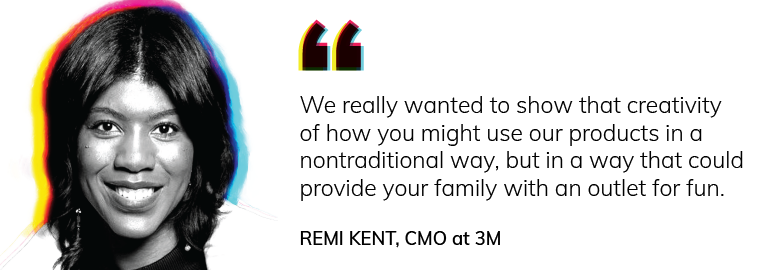
Making science fun and accessible to all is at the heart of 3M’s marketing strategy. CMO Remi Kent explained, “We really wanted to show that creativity of how you might use our products in a nontraditional way, but in a way that could provide your family with an outlet for fun.”
Bold marketing doesn’t always require a complete rebrand or a viral stunt. These creative marketing tactics can be tested quickly and scaled when they work.
Pairing up with a brand outside your category can stop audiences in their tracks. Think Taco Bell and Doritos, or Lego and IKEA. Unexpected pairings spark curiosity and open the door to new markets. The key is to choose a partner that shares your values, even if your products are worlds apart.
Guerrilla marketing is all about disrupting the ordinary. It could be sidewalk chalk art, a flash performance, or a surprising outdoor installation. When executed well, these activations feel more like cultural moments than ads. They generate buzz precisely because they break away from traditional formats.
Your audience often creates content that feels more authentic than polished brand campaigns. Starbucks’ #RedCupContest and Calvin Klein’s #MyCalvins are great examples of customers becoming co-creators. UGC lowers production costs and builds trust because real people represent the brand.
Nostalgia taps into emotions that go deeper than product features. Brands like Pokémon and Nintendo have built entire second lives by reimagining their classics for a new generation. A 90s throwback or retro design element instantly sparks connection because it reminds people of when they first loved your category.
Events, whether virtual or in-person, allow customers to experience your brand in a new way. Red Bull’s Flugtag competitions and Adobe’s creative conferences show how experiences can become brand-defining. Even smaller brands can use pop-ups, live streams, or interactive workshops to create memorable touchpoints.
When brands participate in cultural conversations, they show audiences they’re paying attention. Oreo’s “You Can Still Dunk in the Dark” tweet during the Super Bowl blackout is one of the most famous examples. These tie-ins succeed when they feel natural and timely, so monitor trends and move quickly when opportunities arise.
Supporting a meaningful cause is more than philanthropy; it’s strategy. Patagonia’s environmental stance and Billie’s fight against the pink tax show how brands can build lasting loyalty by aligning with movements their customers care about. The important step is following through with real action, not empty statements.
Sometimes creativity comes from changing how a product is packaged or presented. Heinz’s upside-down ketchup bottle and Reese’s seasonal shapes prove that even small tweaks can make a big impact when they surprise customers. These changes keep products fresh in categories that rarely evolve.
Digital marketing can go far beyond static ads. Interactive quizzes, AR filters, or gamified experiences turn audiences into participants. Spotify Wrapped is a perfect example: it celebrates users while transforming them into promoters who share their results with the world.
Many brands stand out because of how they speak. Wendy’s Twitter roasting competitors on Instagram or Duolingo’s cheeky TikTok presence are proof that tone can capture attention as much as visuals or products. An unexpected voice gives audiences a reason to pay attention in an endless feed of sameness.
Creative marketing ideas are exciting, but they only matter if you put them into motion. Start by defining clear goals for your campaign (ex., awareness, engagement, or loyalty). Choose one or two tactics that align with your brand values, and launch them on a small scale to see how your audience responds. Measure the results, refine your approach, and expand the campaigns that prove effective. The path to standing out begins with a bold step.
Political campaigns are some of the most visible, wide-reaching, and polarizing marketing campaigns. They operate off of enormous budgets with highly condensed timelines, and digital strategy has become an increasing priority as audiences shift online. But even Presidential marketing has its oversights and faux pas.
At 97th Floor, we were curious about how these two campaigns were tackling digital, so we decided to utilize our expertise in performing large-scale audits for both the Biden and Trump 2020 campaigns. We have the best specialists in all of these fields, and we asked our teams to treat these campaigns just as they would a client, auditing every inch that they could.
After pulling thousands of digital ads, reviewing millions of dollars in ad spend, pouring over scores of website pages, reading hundreds of emails, and scouring mobile apps and social media accounts, we found hoards of fascinating insights. It’s a drama-- massive oversights, well-timed reactions, wasted dollars-- but I’ll step aside and let the data tell the story.
After combing through both audits we cherry-picked and pulled the most engrossing snippets into the final version on GetThatVote.com. Read ahead here to see just a few of those highlights.

On a grand scale, the Trump campaign acts as one might expect: big budgets, pushy messaging, and dated tactics. But, while wasted budget is never a pro, the Trump campaign seems to understand its core audience. The campaign’s focus and budget, as well as messaging, are highly targeted to dyed in the wool, red “Patriots.” Team Trump’s digital tactics mirror that of the entire campaign — braggadocious — largely catering to those who are already his fans. Additionally, the Trump campaign presses much harder for donations, which could be one explanation for its ability to outspend the Biden campaign at every turn.
In contrast, Biden’s team hones in on the fringes and the undecided — those who have been historically election-determining, an obvious audience for this (and every) election. This showcases itself in a strong focus on swing states with budget, and a somewhat-humble focus on “togetherness” and “unity” in messaging. The Biden campaign also pushes for a professionalism and issue-based copy that Trump has largely overlooked. A little surprising is the consistently smaller budget from the Biden side, however it’s possible that Team Biden is holding back to increase spending when it matters most, that last month.
Overall, each site caters to the strengths of its candidate. The Biden site emphasizes unity in diversity, with photos of Biden with others rather than alone, and copy that includes words like “together.” Trump’s site leans into the fame of Trump himself. Mentions of specific goals or stances are overtaken by Trump-focused photos and messaging.

As far as general user experience and intuitive flow, Trump’s site takes the cake. Biden’s site overlooks clear messaging in conveying how to volunteer or get involved, and funneling every user into a narrow set of options. The Trump site uses very clear “get involved” messaging in their header, and gives various actions a user could take in order to show support for the campaign. Additionally, Biden’s website feels busy, and lacks an easily navigable hierarchical structure. Trump’s site is well structured, pushing users to either shop or donate.

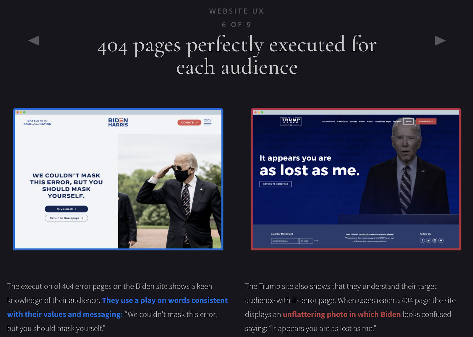
We also couldn’t help ourselves in looking at the 404 pages. Both perfectly represent their target audience: Biden’s responsible mask-wearers, and Trump’s anti-Bidens.
Neither campaign is leaning into search advertising heavily, with text-based search ads accounting for 11.48% and 10.09% of the Biden and Trump campaign’s Google Ad’s budgets respectively. They both make good use of the video elements of Google’s platforms, which may be based on the fact that video is a more immersive experience for the viewer, however it is unusual to see so little budget devoted to image ads given their ability for cheap, but effective remarketing.

The biggest misstep? The Trump campaign paid for the keyword “how to impeach trump.” One might think that this strategy is fascinating, and indeed it could have been, if paired with the right landing page. But when you look at other terms that received significant clicks, you’ll also find terms like, “speedo swim trunks,” “men’s xxl swim trunks,” “trump is a disaster,” and “trump fraud.” The Trump team was apparently not looking at their own search terms report. This oversight is easily fixable by adding negative search terms to their strategy.

Another key difference in strategy is that Biden’s team is using search to prioritize issues, while Trump’s team is here to sell hats (and other merch). Overall, team Biden is performing better in the Google Ads game. However, this is largely due to the fact that they’ve made fewer obvious blunders rather than their own strength on the platform.

I wasn’t impressed by the Trump campaign’s email strategy. The subject lines are flashy, even misleading, resorting to bait and switch tactics. Trump’s email team is pushing hard for donations. Ironically, however, the Trump campaign falters big time when it neglects to add emails entered into the footer of the website into any sort of followup email funnel.

With an average of 2.7 emails sent per day, one has to wonder about unsubscribe rates on the Trump campaign’s emails. The intended strategy may be to hit the audience hard to get recurring donations before they unsubscribe due to email fatigue.

The Biden campaign, on the other hand, seems to want to turn subscribers into advocates, only occasionally asking for donations. His campaign sends significantly fewer emails than Trump’s, with an average of one email every other day. The Biden campaign keeps the issues of their campaign central, and their subject lines helpful and professional. Overall, Biden’s email strategy has a clear advantage over Trump’s in its use of best practices.

Both candidates are running predictable and moderate social media campaigns. Biden is more active on Instagram than Trump, but it’s still surprising that neither candidate makes greater use of Instagram, considering the app’s large demographic of young, often swing voters.

The campaigns’ followers describe themselves in predictable ways: “she/her,” “feminist,” “activist,” and “liberal” for Biden and “KAG,” “patriot,” “conservative,” and “retired” for Trump. However, with only 1.3% of crossover between followers of these accounts, users are essentially tweeting into a political echochamber. It’s also interesting to note that in an analysis of how Biden and Trump advocates speak on social media found that Trump site visitors are twice as likely to talk about the opposing party compared to Biden site visitors.

The most creative social media push from either the campaigns is the Biden campaign’s podcast. This is new territory for presidential campaigns, and while its success has been mostly negligible (it seems Biden supporters are more likely to engage on other channels) it was a creative effort.

The Trump campaign uses divisive ads, intending to both sow distrust in leaders of the democratic party, and raising funds. These ads often include asking users to take a one-sided survey with titles such as: “Official Democrat Corruption Accountability Survey.” These tactics might be duplicitous, but we’d also give them some credit for stepping outside of the box. Both candidates ask for donations, just with a different focus. It seems likely that Trump is receiving more funds from his tactics, but Biden is likely creating more “ownership” from those who do support him by focusing on specific issues and local state battles.

Both campaigns run well-timed ad campaigns with a focus on state-driven ads, a smart strategy for their specific aims. The Trump team consistently spends more but the Biden team places a greater priority on swing states. The Biden campaign spends more in three of the five top contested states, while Florida gets the most attention from both budgets. And, while the Trump team consistently spends more, the Biden team is moving fast, increasing their spending quickly over the past three months.

Many know that SEO is renowned for its lengthy timeline to see results. So, with a fast-paced campaign like the presidential elections, SEO is, and really should be, a lower priority. However, both campaigns are making some pretty simple SEO mistakes that could be avoided with a simple two-hour audit. And, no matter the priority, easy fixes like that are always worth it.

Currently, the Trump team leads in gross organic searches. This is likely due to the fact that their top keyword “trump” has a 10X lead on the Biden team’s “joe biden.” However, the Biden site has the barebones of a non-branded strategy, with pages for terms like “gun safety” and “immigration.” They also make fewer elementary mistakes (homepage errors, missing H1 and H2 tags, the absence of canonical links, poor meta descriptions). While the Trump site carries more weight at the moment, if the campaign were to run for years rather than months, we’d put our money on the Biden site faring better over time.

A candidate’s logo is the centerpiece of the entire campaign. It reflects the values and strengths of a candidate. Logo design goes to Biden for its ability to be transferred to different colors and backgrounds, but Trump makes better use of logo variations for different subgroups. Their campaign colors match their demographic targets. The Biden team chose a bright navy and candy apple red, imbuing a lively, youthful energy, while the Trump team opts for a dark, rich navy and deep, crimson red to suggest seriousness, and an established foundation.

Looking to the campaign sites as a whole, the Trump site is more intuitively designed. Biden focuses on the human element, with copy like “chip in” and a casual, friendly lifestyle video. Trump’s site makes use of a full-screen design, maximizing on-page real estate and making mobile transition easier.

On the Biden site, the navigation is less intuitive, with a nearly overlapping “menu” title. Trump’s site navigation is more intuitive, and the white text allows for a nice eye flow. However, sometimes the white text runs into readability issues when photographs aren’t dark enough to create proper contrast.

The Trump app is a conversion machine, while the Biden app feels like a bit of an afterthought. Trump’s app holds the hand of the user throughout the entire app experience, with easy navigation, clear calls to action, and incentives for those who donate. Biden uses his app to share his vision, conveying a sense of togetherness and altruicity.

While not an essential part of a campaign, superfans will certainly download and use the campaign apps, so it’s definitely not an avenue to ignore. Both apps could definitely use some attention, but overall, the Trump app makes better use of the unique app format by giving benefits that are only available in the app.

Commercial strategy might be the greatest failing in the Trump team’s digital campaign. Their strategy is largely national, with little attention to specific state markets, including swing states. For example Florida, the state that has the most money going into it from both candidate’s Facebook and Google Ads, is being completely ignored by the Trump campaign. This is hardly strategic, seems more like an oversight.
Visual storytelling is a universal mode of communication that has been in use since the beginning of time. And, through the ages of cave art to silent movies, it has shown itself to be one of the most effective ways of catching not only human attention.
It’s no different in this day and age. From the humble blog article to the Times Square billboard, visual elements tell the story as importantly as copy. No marketing campaign is complete without striking visual elements, and more than likely, that’s what your potential customers will remember.
We’ve compiled 7 storytelling strategies to help elevate your brand:
It takes the average person just 50 milliseconds to form an opinion about a webpage, and 2.6 seconds for their eyes to settle on the most impactful spot. That’s not a lot of time for your brand to make a good impression.
You need to capture people’s attention quickly and slow their scroll down. Even the most avid readers skim webpages. And as people scroll, words get blurred together, losing their impact. If there is no imagery in your storytelling, it’s likely your readers will bounce from your page quickly.
Picture this: a web page advocating a new weight loss method that only includes text, OR a similar ad that includes a striking before-and-after image. Which one are you more likely to stop and look at?

When time is money, getting users to take time out of their day to stop and look at what you have to offer is essential to driving revenue.
Most people remember what they see far better than what they hear. According to some studies, there can be up to a 65% increase in retention if the information is obtained visually. And the best part: images require zero work for the user. Sifting through text is hard, but taking in imagery? That’s fun.
We cling to images in storytelling because they allow us to interpret the information for ourselves, rather than being told how to interpret it. Good images don’t require an explanation. Instead, they tell personal and applicable stories without using words.
Nike’s home page is a great example of this storytelling strategy. Their first fold is an eye-catching video, and their second fold looks like this:

They tell the story of each sport with both text and images, but, as you can see, the text is a very small portion of the story. The majority of the page is taken up by action imagery showing users what playing each sport looks like. And, it looks cool. Can’t you see yourself gearing up for football or playing soccer with the best of them? Most importantly, you could find exactly what you needed from this page without any text at all. And that’s how it should be.
You’ve probably put together an IKEA dresser without reading any of the written instructions. If the visual queues are clear and walk you through the process with baby steps, image-only instructions can be just as effective and a lot less stressful.
Think of the signs that we use in driving. A few have text, but the majority use color, shape, and image to portray their instructions. Similarly, it’s not uncommon to see images in the business world that give customers instructions using no text at all.

How much more enticing is this video on making cheesy potatoes rather than reading a blog post on how to do it? It’s approachable, entertaining, and makes it look easy. Visual instruction is on the rise.
While I wouldn’t recommend doing away with text entirely, I would encourage you to think about how using visuals more strategically could positively change your marketing efforts. Images have the power to instruct your users, which means you have the power to influence what actions they take next.
Take a look at this example from Upright Pose:

This image tells a story, and gives an obvious next step: you’ve been slouching a lot lately, you’re worried about your health, and the solution is to buy Upright Pose. Textual calls to action are important, but they’re also pretty obvious. Imagine the ability to influence a user’s next step without them even realizing they are responding to a call — well-planned and properly placed images have that potential.
Pretend you’re watching a video ad. The camera follows a man getting ready for the day in an average-looking home. Suddenly, he notices a brown paper lunch bag on the kitchen counter. He snatches it up and rushes outside to hand it to a little boy waving goodbye on his way to the bus stop.

Did you need a narrator to tell you that the man is in his own home? That the little is boy his son? Of course not. You followed the context of the story just fine. In fact, having that information spoken would seem silly because it’s so unnecessary.
Take advantage of the human ability to read context in a story. Don’t waste time spelling out information you could give your audience through your images. They’ll pick up the information faster and with more ease, leaving them with a better idea of what you have to offer them, and more energy to move closer towards conversion.
Take a look at this ad from Nikon:

They didn’t need words to let you know that, surrounded by mountains and wilderness, you might find a use for binoculars. Wouldn’t you still feel drawn to the binoculars and the adventure they promise without any words? That’s how the best images use context. They tell an entire story simply through what you see.
Humans are the center of our universe. When we see images, we want to be able to place ourselves within them. We want to know how what you are offering will help us do better or feel better.
So, it’s smart to focus on people when you plan your visual storytelling strategy. Whether that means you show people in your marketing, or whether the implication is implied, the focus needs to be on the humans in the story, not the product.
Look at this visual from Outdoor Voices:

Yes, Outdoor Voices’ products are showcased, but the focus is not on the people. They tell the story of how the product is used and how it makes human lives better. It is the people in the image that make the product notable, not the other way around.
Like we’ve talked about already, the best images tell stories, and the basis of any good story is conflict. So don’t shy away from it! When you can use an image to show potential customers the conflict that your product or service will solve — and not just the conflict, but the solution itself — that is a golden storytelling technique..
Take a look at this advertisement from Home Depot:

In the image, we see a common pain point that Home Depot’s business solves. The messy porch, the leaves on the cement, and the bucket that shares the solution: Home Depot can help you clean up this mess.
People understand conflict, and they crave solutions. Your images can bring out an emotional response from your potential customers that it would take pages of text to convey. Images can speak volumes in a story, so let your images share your conflicts and solutions.
You probably have different colors and styles that you like or don’t like, ones that make you feel good and others that drive you crazy. But designing images for your brand’s story goes beyond preference. Good design can make or break your website, your advertisements, and eventually hurt your revenue numbers.
It’s time to start thinking less like an artist and more like a designer. Artists make things that are beautiful, while designers have a purpose behind their products. Every color or pattern is there for a specific reason. Visually pleasing arrangements (put in place for a specific purpose) are more likely to put your potential customers at ease, tell them your story, assure them of your professionalism, and sell.
Take a look at these two cartons of chocolate milk:

One is a generic brand, the other is a Fairlife product. Fairlife understands that even if they want customers to believe their product is top-notch, their product’s design had better tell that story. The generic brand doesn’t look the part of an elegant, high-end chocolate milk. But it’s not trying to be something it’s not — it’s a generic brand for a reason. So while it may not look “pretty,” its design is telling its own story: run-of-the-mill chocolate milk is 20-40% cheaper and tastes just fine.
Here is another example, this time with websites:

These are both homepages of interior design companies. While both do great work in reality, Amber Interior’s website design intentionally shows users the quality of work they are able to do.
As you can see, the visual storytelling strategies and design of a website or brand truly have the potential to make or break your opinion of them.
It only takes a minute to look at your brand’s visuals with these tips in mind. Evaluate where your brand is succeeding, and where there might be room to improve. Then put a plan in place to optimize your visuals and bring your brand’s game to the next level — increasing your revenue and sales. Remember: a picture is worth a thousand words, so make sure your pictures are saying the right words.
Strong storytelling strategies make your brand stand out and stay memorable. By blending visuals, context, and emotion, you can create stories that connect deeply with your audience and drive measurable results. If you’re ready to elevate your brand through effective storytelling strategies, the team at 97th Floor is here to help.
Storytelling strategies in marketing are structured approaches that brands use to create compelling narratives. These strategies help businesses connect emotionally with their audience, highlight their value, and inspire action. A good storytelling strategy blends visuals, emotions, and clear messaging to make the brand memorable.
Storytelling strategies are important because they turn ordinary marketing into meaningful experiences. Instead of just promoting a product, brands using creative storytelling build trust, humanize their message, and create lasting emotional connections that drive loyalty.
To create an effective storytelling strategy, brands should identify their audience, define their core message, and select visuals and formats that resonate. Incorporating conflict, context, and human-centered visuals are proven storytelling strategies that improve engagement and brand recall.
Check our examples in the article for specific callouts! A hypothetical example could be a cosmetics brand using Instagram Reels to show customer journeys, incorporating user-generated content to build trust, and leveraging video testimonials to demonstrate conflict and resolution.
The success of storytelling strategies can be measured through marketing performance indicators like engagement rates, time spent on page, click-through rates, and conversions. Tracking these insights ensures your storytelling strategy is both effective and aligned with business goals.
Common mistakes include focusing too much on the product instead of the people, using inconsistent visuals across platforms, or overcomplicating the message. Avoiding these pitfalls ensures your storytelling strategies remain clear, authentic, and impactful.
Talking about design, and giving feedback can be difficult. Sometimes it feels as though there’s a whole language you don’t know how to speak. And when you can’t find the words, it’s a challenge to get anything done the way you envisioned it in the first place. Here are a few pointers to help you communicate better with your designer so you can both end up in a place you’re proud of.
There’s nothing more frustrating for graphic designers than finishing a project and being notified of an issue that could have been addressed (and fixed) in the early stages. If you have concerns or feedback about something, voice them early and as they arise. Waiting until the end of a project to address the issue only makes things worse. Most often, it creates a domino effect of other changes that now must be made.
Don’t be afraid to give a free and honest critique. Graphic designers expect opinions, and yours are valid. Everything should be up for discussion. Remember, you know your brand/company/product the best. Your designer needs your voice on that front. While some feedback may seem obvious to you, it may not be obvious to your designer. Be sure to share your concerns. If you don’t tell your designer you think something needs to be revised, they won’t know there’s an issue. And when words are hard to find, gather examples. Show your designer what you like and/or what you don’t like. This will help carve a more guided path for the designer to take.

When it comes to graphic design, there are 5 main principles your feedback should live under.
When you give feedback, be specific to one of those principles. Instead of saying, “Make it pop.” Say, “I’d like to see brighter colors.” The field of interpretation to “make it pop” opens up a sea of possible solutions. But by being specific, the graphic designer can then ask more clarifying questions. Do you like the current color combination? Do you want brighter hues of what we have, or new colors? This will help pinpoint the root of the issue.
Poor: “Make it pop.”
Good: “I’d like to see brighter colors.”
Best: “I’d like to see brighter colors because it’ll show up more prominently. It also relates to our youthful audience.”
Telling your “why” helps the designer see from your perspective beyond your feelings or emotions (“I think” and “I feel” statements). Giving specific feedback is helpful, but explaining the “why” can really visualize your thought process. Opinions (“I think” and “I feel” statements) hold weight, but “why” statements can reveal more substantial underlying points worth talking about.
Design is subjective. While you may feel strongly one way about a design, your designer may feel the opposite way. State your case. This means you’re giving specific feedback and following your feedback with the “why” behind it. After you state your case, be sure to ask and listen for your designer’s reasoning. Design is full of decisions that you may not be aware of. Find out what the designer insists is necessary to the project, then compromise on what can be changed.
With shrinking attention spans and endless digital content in 2025, it’s harder than ever to stand out. Enter the infographic! A well-structured infographic turns complicated or “boring” information into something clear, engaging, and easy to digest in seconds. If you’ve ever wondered what makes a good infographic, you’ve come to the right place. In this article, we’ll go over 7 tips for making your infographics picture-perfect. Done right, an infographic can make your content unforgettable.
In 2025, people want answers fast. Long reports and walls of text often go unread, but visuals cut through the noise. Infographics present data and insights in a format that’s quick to scan, easy to share, and simple to remember. Infographics double as pretty visuals and communication tools that help your audience grasp complex information at a glance. From social media to sales decks, a strong infographic can extend the reach and impact of your message.
An infographic distills complex data into a structured visual format that the brain can process faster than text alone. Studies in cognitive psychology confirm that people retain information more effectively when it is paired with visuals, because the human brain processes images up to 60,000 times faster than text. That means your audience can understand trends, relationships, and comparisons at a glance rather than working through pages of copy.
From a marketing perspective, infographics are also highly versatile. They can improve on-page engagement by breaking up content, drive backlinks as shareable assets, and perform well across platforms, from LinkedIn posts to conference presentations. When designed with accessibility and mobile in mind, they increase reach even further by ensuring clarity across devices.
So, what makes a good infographic stand out from the rest? The best designs share a few common elements: credible data, clarity, storytelling, smart visuals, simplicity, breathing room, and adherence to design standards. Together, these elements form the foundation of an infographic that catches readers’ attention. Let’s break down each one.
The key to a good infographic is using relevant, focused, and reliable data. Before you write or design, get to know your audience. Why are they interested in your topic? How much do they already know? Do they have preconceived ideas or opinions about your topic? Answering these questions will help form more relevant data and visuals. An infographic should be a visual presentation of evidence, with purpose and direction, not just an excuse to use pretty pictures. Don’t include facts just to up your word count. Make sure your facts and data support the overall story and have a purpose.
Especially when choosing a controversial topic to be thorough and speak to both sides of the story. Think through the topic’s possible arguments and counterarguments. Use facts, statistics, and authoritative quotes that are unbiased.
Use as little text as possible and let the visuals do the rest of the talking. Present the data in a visually pleasing way, stating hard evidence. Facts, statistics, and quotes from authorities should be used more than lengthy sections of text. Cite your sources. Always give credit where credit is due, and use reputable sources.
Thinking outside the box is great. Just make sure you are still making sense. Don’t use confusing comparisons or complicated visuals. Lead the audience through the infographic using both text and visuals.
An infographic should not just make data interesting, but help the reader understand it better than text alone. Don’t rely on the reader to do the work. Guide them through the information as clearly and simply as possible. Data visualizations draw attention and give importance to seemingly boring facts. The right visuals can distill a difficult concept or lots of data into an easily digestible image that should only take 5 seconds to understand.
“An infographic is 30 times more likely to be read than a purely textual article.”

Display the data using a variety of charts and graphs. Make sure to choose the right graph or format for the data you are sharing. Always check that the graph makes sense visually, without the need for extensive knowledge on the subject or heavy reading. Below are a list of a few types of graphs and charts that can be used in creating an infographic.
More doesn’t always mean better. In fact, clutter is the fastest way to lose your audience. A simplified infographic strips away distractions and highlights only the essentials. Stick to one main point per section. Use a limited color palette. Don’t let decorative elements compete with your data. Remember, an infographic is meant to clarify, not complicate. Consider color theory. Do the colors help tell the story? Why?

White space isn’t wasted space; it’s breathing room. It separates ideas, guides the eye, and makes complex information feel approachable. Imagine walking into a crowded room vs. one with open pathways; which feels easier to navigate? The same principle applies here. Use white space to group related visuals, emphasize hierarchy, and keep the design from overwhelming readers.
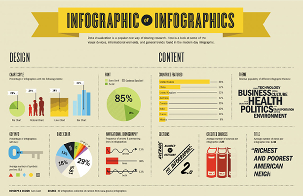
The typical infographic should be no more than 5000 pixels tall. This size allows for easy reading and sharing; anything longer will likely lose the audience's attention. Make sure the font is a healthy size and easy to read. An infographic is NOT an entire article with icons and images sprinkled in. As one marketer said,
“‘Infographics’ is one efficient way of combining the best of text, images, and design to represent complex data that tells a story that begs to be shared." - Jeff Bullas
Infographics, if created and used correctly, can communicate complex data in a visually pleasing way that can get you more clicks, views, and shares.
A good infographic is clear, focused, and visually engaging. It should tell a story, use reliable data, and be easy to understand in just a few seconds. The best ones are also mobile-friendly, accessible, and shareable across multiple channels.
What makes a good infographic is partly its length. Most perform best under 5,000 pixels tall, which allows readers to scroll easily without losing interest. Keeping it concise ensures your audience stays focused on the main takeaway.
When people ask what makes a good infographic, the answer often starts with what not to do. Overloading with text, using confusing visuals, or skipping source citations can all weaken the message. A strong infographic avoids clutter and keeps the design focused on clarity.
Simple charts like bar graphs, line charts, and pie charts are usually most effective. Save more complex visuals — like scatter plots or bubble charts — for when they genuinely add clarity. Always match the chart to the type of data you’re showing.
Yes. Always cite your sources. Credible, transparent sourcing builds trust and authority. Place citations at the bottom of the infographic or include them in the caption on your site.
Distribution plays a big role in what makes a good infographic successful. Keep the design clean, the story sharp, and then repurpose it into social media snippets, carousels, or short videos. The more channels you use, the more visibility your infographic gains.
In a world where information moves faster than the speed of light and is produced almost as fast, it is important to stand out. The key to standing out is a well designed visual. Humans not only respond faster but also retain more information from images and graphics than from text alone. Visuals are also easily shared, which leads to more views, links, and better search engine optimization.
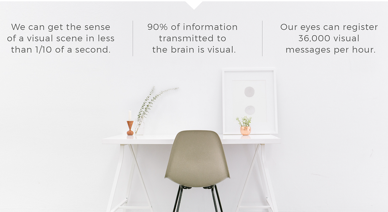
Studies have shown that humans process and respond to visual data better than any other type of data. The human brain is capable of processing images 60,000 times faster than text. Additionally, 90% of information transmitted to the brain is visual. Visuals capture and hold viewers’ attention.

Information is more likely to stay with you when presented visually.

Eye-tracking studies show internet readers pay close attention to information-carrying images. In fact, when the images are relevant, readers spend more time looking at the images than they do reading text on the page.

Visuals help tell your brand’s story in a memorable way and demonstrate your brand as an authority in your industry, building brand awareness.

Visuals are easy to digest, and transmit data faster and easier, which means they stay with you longer than text. If a relevant image is paired with that same information, people retained 65% of the information three days later.
Graphics are more convincing and influencing. Visuals trigger emotions and motivate the audience. The emotional power comes from the ability to show you an idea, relationship, or how something works.
People that follow directions with text and illustrations do 323% better than people following directions without illustrations.

Visuals are easy to share and drive traffic. Visually appealing graphics are more likely to be shared on social networks and become viral compared to ordinary text content. Graphics create more opportunities for link-building, which also impacts your site’s search engine optimization.
Every interaction a user has with your company tells a story. And that story starts long before someone clicks a button or fills out a form. It begins with how easily they understand what you offer, how confident they feel moving through your experience, and how quickly they can get what they came for.
In other words, it starts the moment they begin to experience your brand.
A UX design strategy defines how user experience decisions are planned, prioritized, and connected to business outcomes. It ensures design choices are intentional, informed by research, and tied to real goals like growth, engagement, and revenue. Without strategy, design becomes reactive. With strategy, design becomes a tool for progress.
Psychology plays a central role here. Users bring expectations, habits, and emotions into every interaction. A strong UX design strategy accounts for how people think and how they decide to act as they move through an experience. When psychology and strategy work together, user experiences feel trustworthy and effective.
Here, I’m going to break down what UX design strategy is, why it matters, and how it impacts both users and businesses. I’ll cover the benefits of a strategic approach, the core components that make it work, and the psychological principles behind effective experiences (and how intentional UX design supports conversion, retention, and long-term growth). And, because this is a company blog and we’re proud of the work we do, I’ll also discuss how 97th Floor approaches UX strategy as a collaborative, research-driven process.
UX design strategy is the plan that guides how user experience decisions are made to support business goals and user needs. It connects research, design, and execution into a cohesive direction. While UX design focuses on individual interfaces and interactions, UX strategy defines the why, when, and priority behind those design choices.
At its core, a UX design strategy brings together research and usability principles, supported by psychological insight and organizational alignment. It creates a shared understanding of users and clarifies how the experience should support both them and the business.
A UX design strategy gives teams a clear framework for making decisions that serve both users and the business. Instead of relying on opinions or assumptions, strategy creates direction and consistency across the entire experience.
This matters because it:
A UX design strategy is made up of several connected parts that guide how experiences are planned, built, and improved. Each of these components plays a specific role in shaping how users move through an experience and how well that experience supports business goals.
Research sets the direction for every UX decision that follows. By studying user behavior and gathering stakeholder input, teams gain insight into needs, expectations, and obstacles. This groundwork helps reduce assumptions and ensures design decisions are based on real evidence rather than internal opinions.
Usability focuses on how easily users can navigate and complete tasks. Clear pathways and familiar patterns help users move through an experience without confusion. When usability is prioritized, frustration is reduced and progress feels natural.
Information architecture determines how content is structured and labeled. A thoughtful structure helps users understand where they are and where to go next. When information is organized in a way that feels intuitive, users can find what they need with less effort.
Interaction design defines how users engage with elements on a screen. Buttons, transitions, and feedback signals all influence how responsive an experience feels. Well-planned interactions guide attention and reinforce a sense of control.
Accessibility ensures experiences can be used by people with different abilities and needs. Designing with accessibility in mind improves usability for everyone and helps brands reach a wider audience. It also signals care and responsibility in how experiences are built.
UX copy supports users through clear and purposeful language. Labels, prompts, and instructions help users understand what actions are available and what will happen next. Good UX copy removes uncertainty and keeps experiences moving forward.
Testing and iteration allow teams to refine experiences over time. By observing how users interact with designs, teams can identify issues and make informed improvements. This ongoing process helps experiences stay effective as needs evolve.
Cross-functional alignment keeps UX efforts connected to broader business initiatives. When design, development, and marketing teams share the same goals, execution becomes more efficient. Alignment helps ensure the experience feels cohesive from start to finish.
We make daily decisions on what brands we choose to engage with, what brands have earned our trust, and what brands compel us to spend money. How do we make those decisions?
Psychology studies have shown that our feelings and instincts cause us to behave. It is said that emotions drive 80% of the choice we make. So the first visual impression a customer receives from your brand is crucial to a positive customer experience, or a customer experience at all.
Good design is more than just good looks, it’s the catalyst to trust and loyalty towards any brand or company.
Trust is often the first hurdle a brand needs to clear, and design is usually the deciding factor.
That’s because design is emotional. It evokes moods, attitudes, and personality. Together, these emotions create “gut feelings” and stir thoughts in our mind. And before even being exposed to actual content, visual queues have already shown us how to feel towards a brand.
So when we’re browsing the web and come across a ‘spammy’ looking website, the visual queues are telling us it’s untrustworthy. When junk emails pop up, poor design makes us question the legitimacy of the content. When we find a good deal on the web, but the checkout page to fill out credit card information looks sketchy, we back out. As a result, we don’t engage with the brand, we don’t subscribe to the service, and we don’t buy anything at all. And it all comes from gut feelings created by bad design.
And when trust breaks down at the visual level? Users rarely stick around long enough to reconsider.
Belief is what bridges the gap between curiosity and commitment.
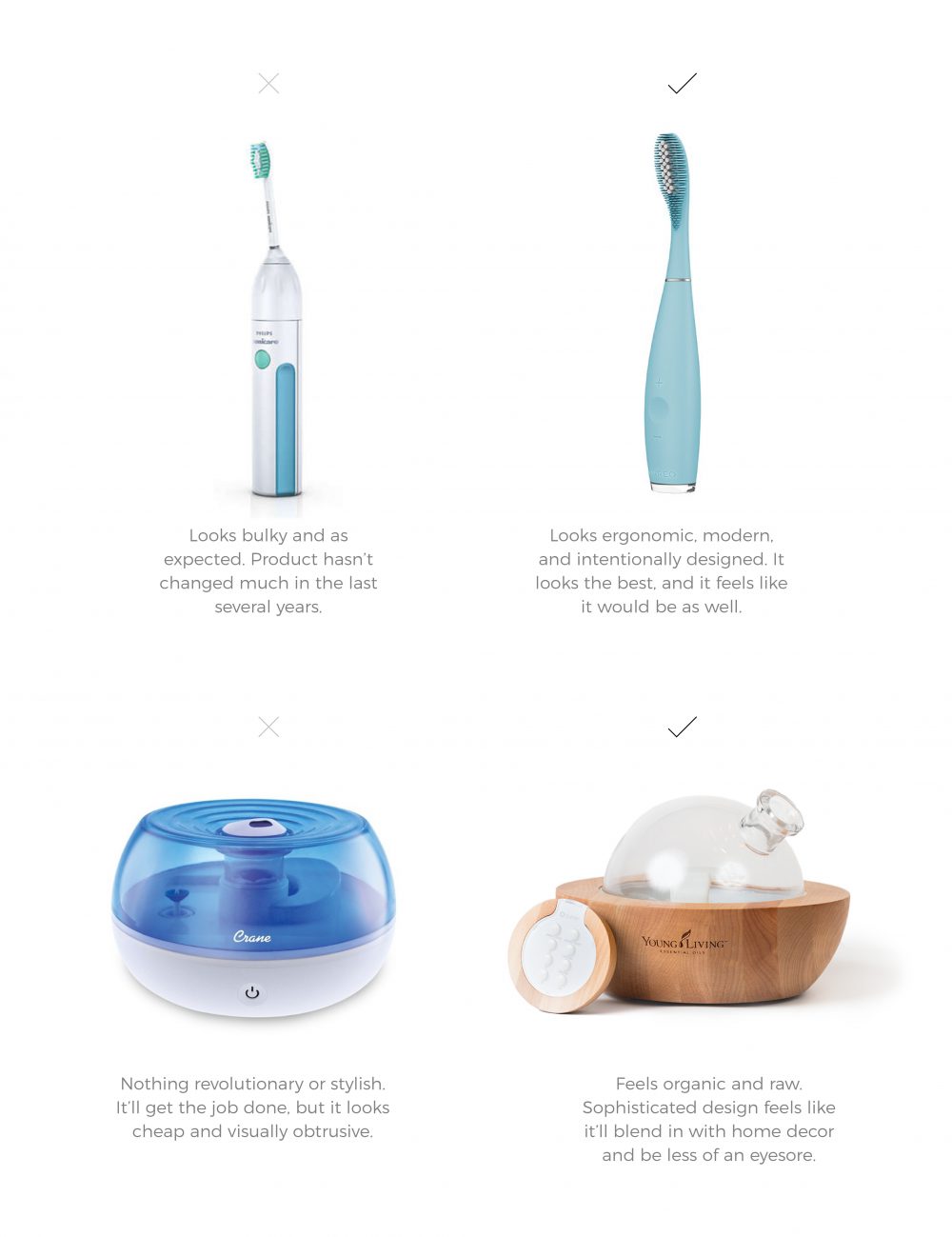
There’s a reason for the old adage don’t judge a book by it’s cover. It’s because we do! As consumers, we expect the quality of products/services to match their appearance. We don’t have time to be convinced that a certain brand/product/service is good, we should already be able to see that it is (or isn’t). A brand with good design is more convincing than a brand with bad design because we assume appearance reflects quality.
Have you ever found yourself wanting to purchase the organic or brand name cereal rather than the generic brand? We expect good packaging design to be the shell of a good product. Have you ever spent more money on a product just because it looks better than the cheaper version? By sole appearances, we assume more credibility with one brand than another, and we take one brand more seriously than another.
When design communicates quality clearly, customers are more willing to give you the benefit of the doubt.
Brands with an up-to-date design make us feel like their product/service is likewise current and relevant..
Some brands stand out as cutting edge in their industry simply because they look the part. We’d be less likely to purchase a product from a website designed in the 90s, because we associate the outdated web design to the product/service. It’s as if we think, how can a product/service with a website from the 90s, serve the needs I have in 2026? There’s got to be another brand who is more current and fresh. With no progression in any aspect of design, it’s easy to assume there hasn’t been progression with the product/service either. A brand’s entire look and feel should show that it is leading the industry. Brands who look the part, convince their audience that they actually are.
Think of it like this: when design reflects forward momentum, audiences are more inclined to believe the brand can meet modern needs.
Design isn’t just how your brand looks; it’s how it feels. Feelings and instincts from good design cause positive behaviors. And the same goes for bad design causing negative behaviors.
Simply put, design dictates the user experience. So, take a second look at your brand. Does the design reflect the quality of your service/product? Is the design of your logo, website, flyer or whatever visual medium you’re using to communicate with your audience look like you’re a superior, dependable brand? Or do your visual mediums make viewers hesitate?
Visual design focuses on how an experience looks. UX design strategy focuses on how that experience works, why decisions are made, and how success is measured.
Psychology informs UX by explaining how people perceive information, form opinions, and make decisions. UX strategy uses that understanding to guide structure, flow, and priorities across the experience. Visual design then supports those decisions by expressing them clearly.
In terms of scope, UX design strategy is the broader of the two. It considers research, usability, business goals, and cross-functional needs. It is also measurable, with success defined through outcomes like engagement, conversion, and retention (rather than preference alone).
Building a UX design strategy requires intention, structure, and a willingness to learn from users. While every organization is different, most strategies follow a similar progression.
UX design strategy becomes clearer when viewed in context. Consider the following hypothetical scenarios:
These are, of course, only a few examples. The reality is when it comes to UX strategy, design must be adaptable to your product, your audience, and the specific situations where the two come into contact. A firm understanding of customer psychology, backed by reliable research, makes this possible.
UX design strategy matters because it shapes how users experience your brand and how confidently they move through it. When strategy is grounded in psychology and supported by research, design decisions become more justifiable and easier to scale. Teams gain clearer alignment, usability improves across touchpoints, and development effort is spent solving the right problems.
If you’re ready to build or refine your UX design strategy, 97th Floor partners with teams to create research-backed experiences that support both users and business goals.
UX design strategy is important because it helps businesses plan experiences that support growth, trust, and usability. It gives teams a framework for making informed decisions rather than reacting to issues after launch.
A UX design strategy improves user experience by reducing friction and clarifying pathways. When experiences are easier to navigate, users feel more confident and supported, which leads to a more satisfying brand interaction.
A strong UX strategy design includes research, usability planning, information structure, accessibility considerations, and ongoing testing. These components work together to guide consistent decision-making.
UX design strategy reduces development costs by identifying problems early. Research and testing help teams avoid building features that require rework.
UX strategy design increases conversions by making actions clear and reducing hesitation. It supports retention by creating experiences users can rely on over time.
UX design strategy creates alignment by defining shared goals and priorities. When teams understand the strategy, collaboration becomes smoother and decisions are easier to support.
User research provides the insight needed to make informed UX decisions. It helps teams understand behavior, expectations, and obstacles before design work begins.
Companies can get started by clarifying goals, conducting user research, and mapping key journeys. Partnering with experienced UX strategists can also help accelerate progress and reduce risk.